SINNER
A streetwear identity built to stand out.
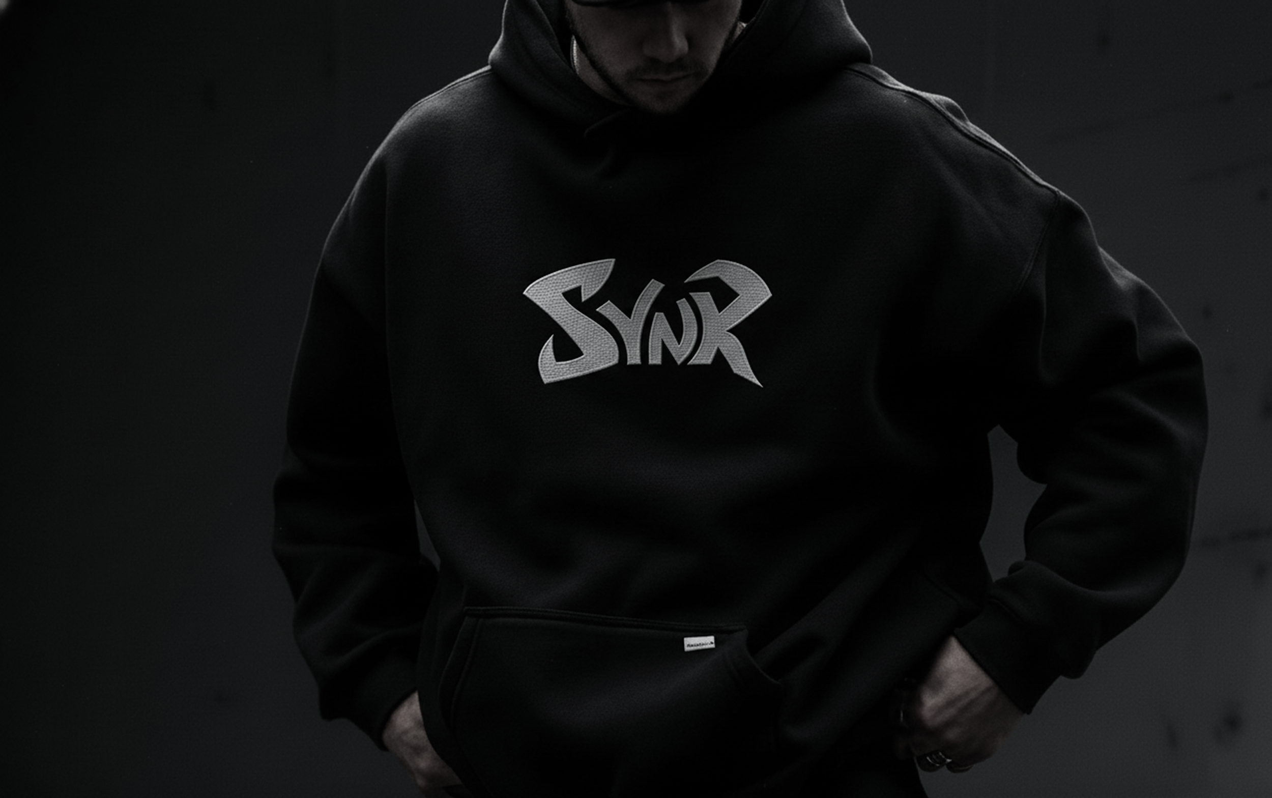
A streetwear concept exploring bold lettering and a stripped-back visual style.
Built through form, color, and detail.
Sinner explores a more defiant side of contemporary apparel branding. The identity uses angular lettering, assertive scale, and stark contrast to give the brand a distinctive presence across clothing and supporting touchpoints.
Defiant
An expressive mark with sharp, energetic forms.
High contrast
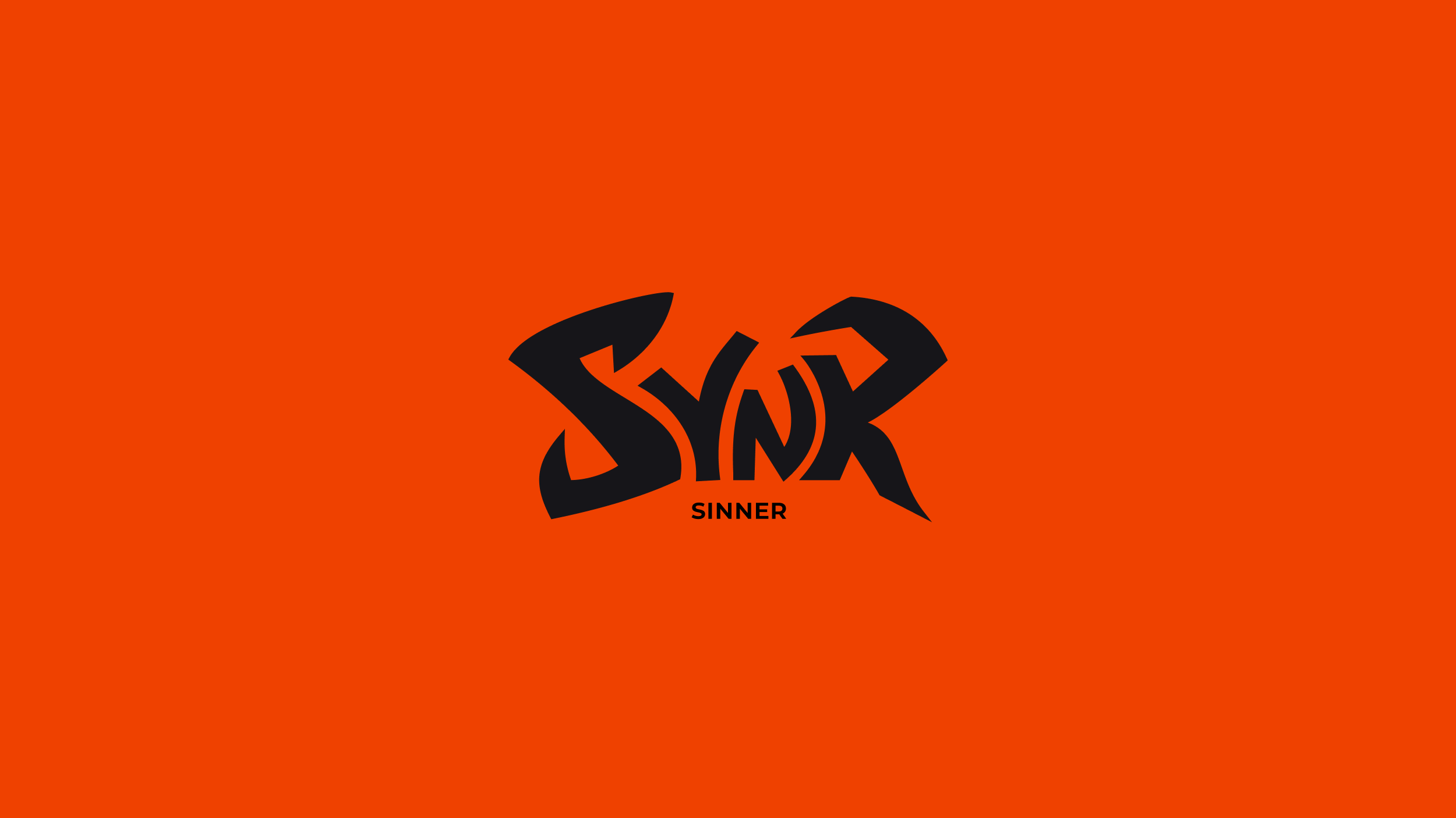
A dark foundation punctuated by vivid orange.
Apparel-led
A graphic identity designed to live on garments.
A graphic signature with its own silhouette.
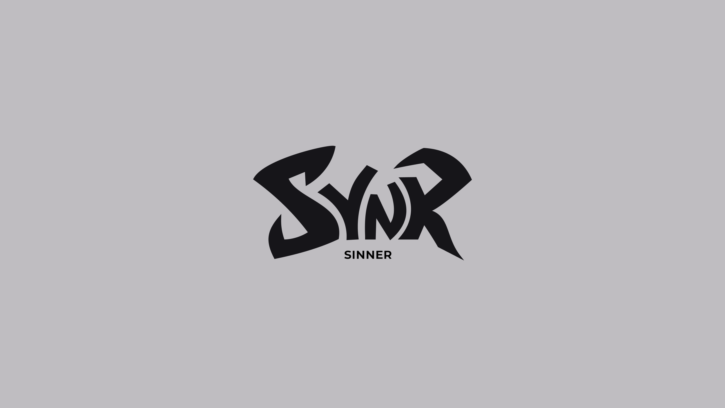
The custom-style wordmark is the core brand asset. Its angular contours and compact rhythm give it a strong visual presence on apparel and brand materials.
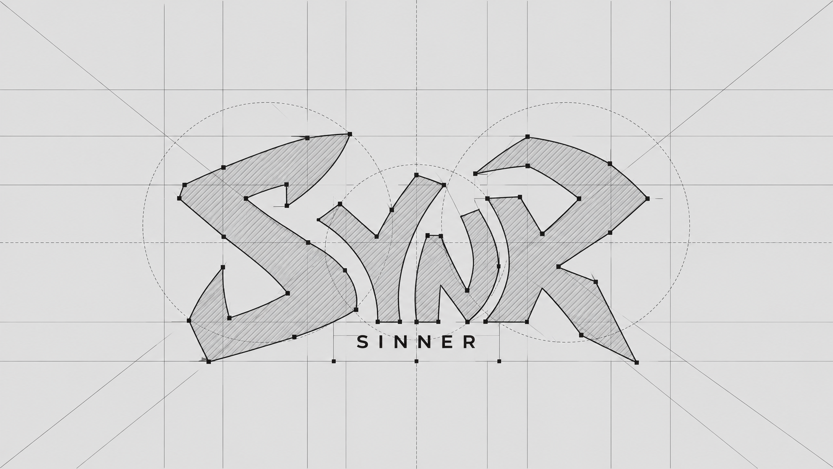
Built from shape, rhythm, and contrast.
The construction study reveals the underlying geometry behind the mark. It documents the logo as a considered graphic form, rather than treating it as lettering alone.
Primary mark
The expressive wordmark leads the identity and is intended to remain the most recognizable element.
Monochrome variants
Alternate light and dark treatments provide flexibility across contrasting backgrounds and materials.
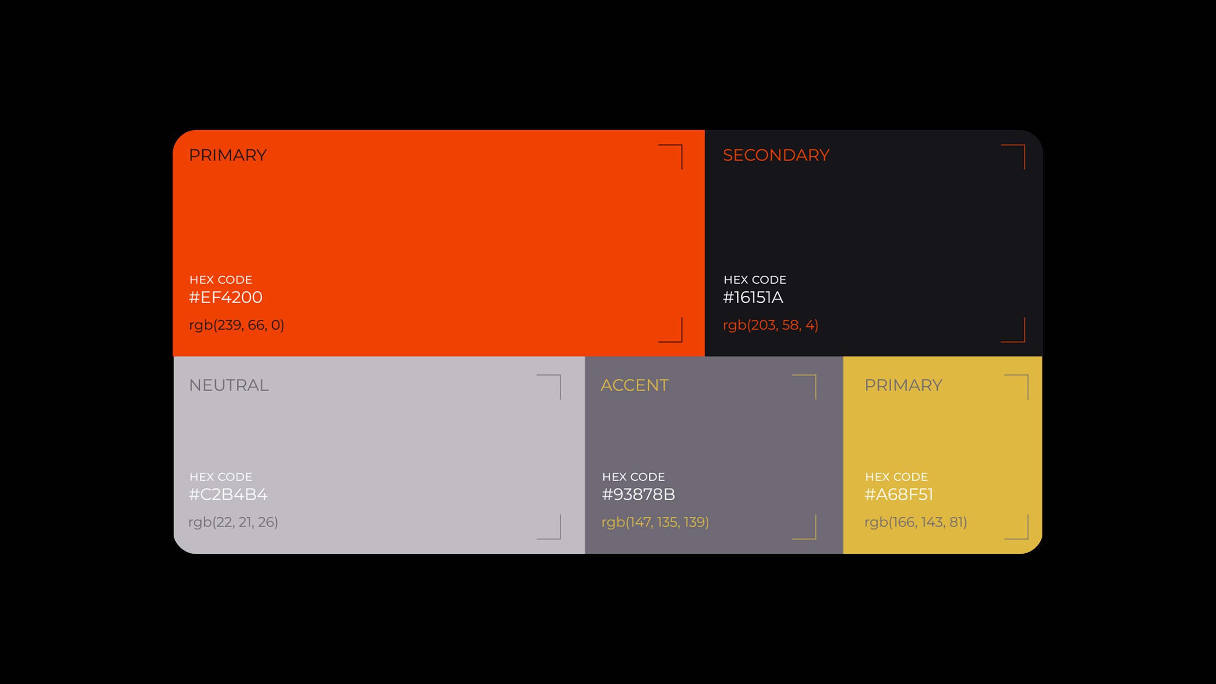
A restrained base. One unmistakable signal.
Black and neutral tones establish the foundation, while vivid orange provides a strong accent for high-impact brand moments. The palette can shift between understated apparel imagery and brighter graphic applications.
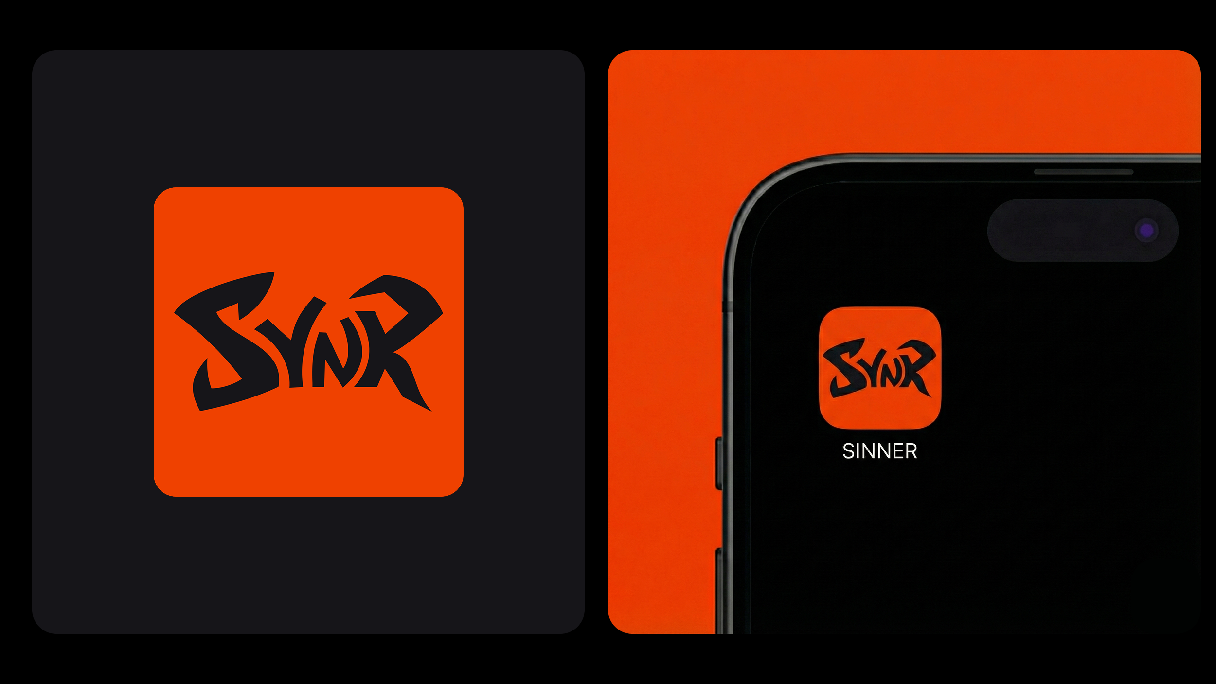
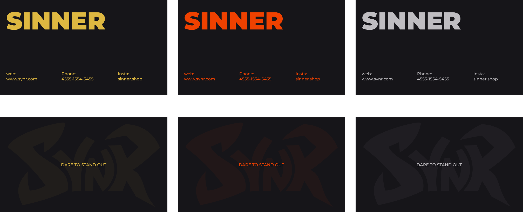
One identity, across the details people encounter.
From digital touchpoints to physical brand materials, the applications explore how the wordmark carries through different formats while keeping a consistent visual character.
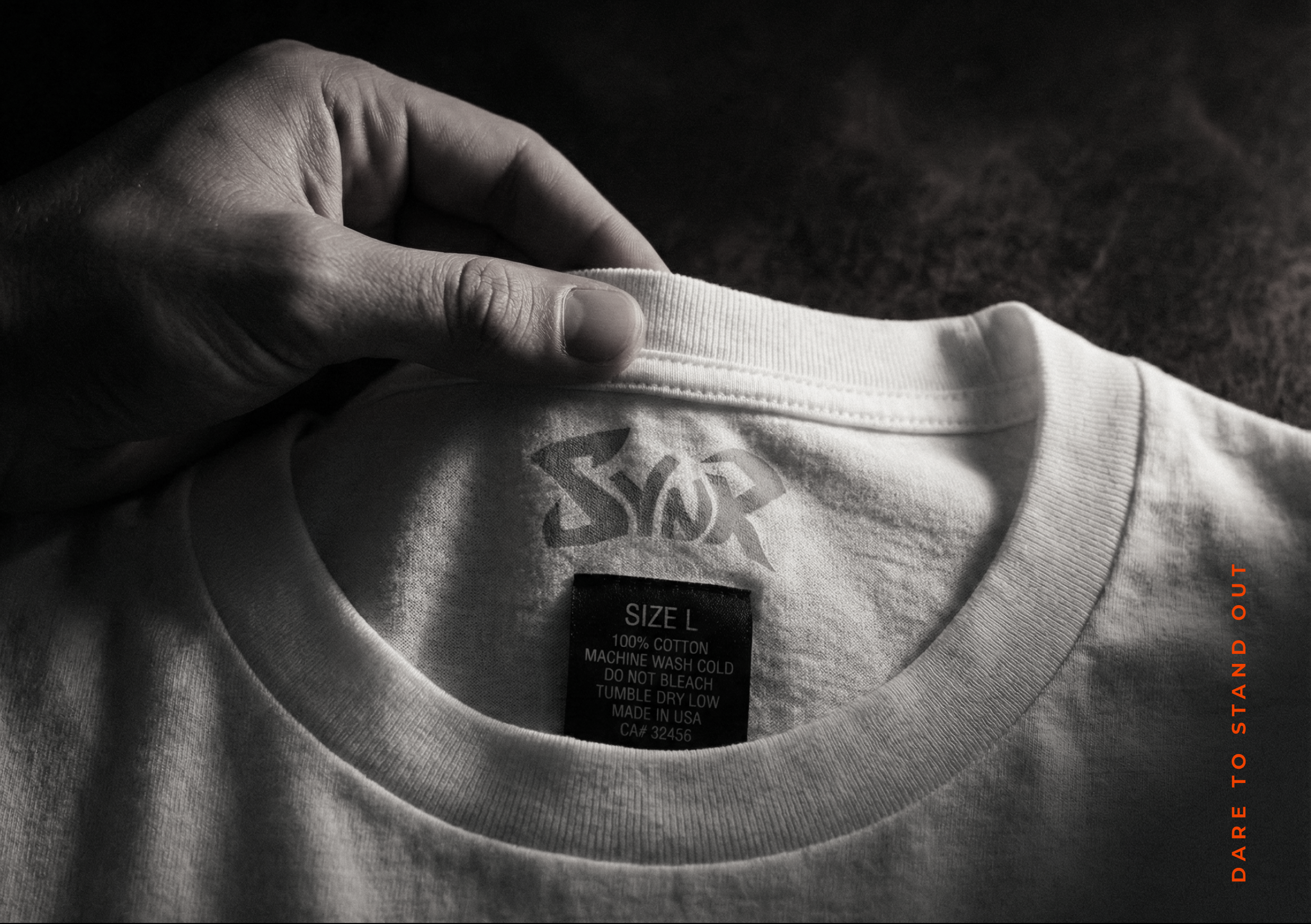
Made to be seen. Designed to be worn.
Sinner brings its graphic identity into an apparel-led visual world, pairing expressive branding with dark, tactile product photography.
A visual identity concept for contemporary streetwear.